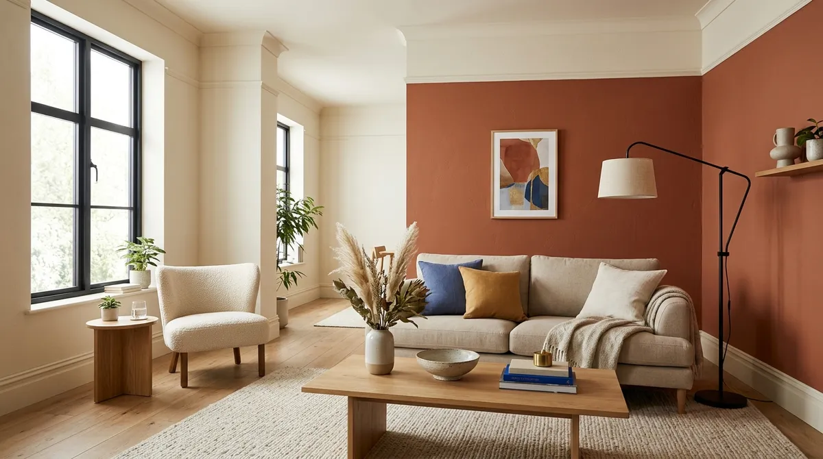
Why Color Choices Matter for Room Harmony
If your room feels perpetually "off" despite your best decorating efforts, according to reports, the issue may lie in your color decisions. Design professionals emphasize that intentional color choices can create the visual harmony and sophistication needed to transform a disorganized space into a serene retreat.
The Foundation: One Bold, Cohesive Color Decision
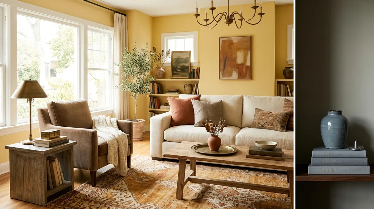
Designers recommend starting with a single, bold color decision as the foundation for your entire room. This approach creates an anchor point that guides all other design choices, preventing the scattered look that makes spaces feel chaotic. Rather than introducing multiple competing colors without purpose, this strategy provides clear direction for your design journey.
Creating Stability with Neutral Bases
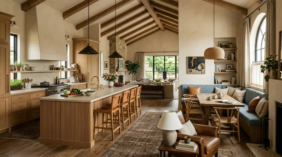
According to reports, using a neutral base serves as an effective way to anchor your room design. Neutral foundations provide stability and allow other design elements to shine without overwhelming the space. This approach creates a calm backdrop that can accommodate both bold accents and subtle decorative touches.
The Three-to-Four Color Rule
Design professionals advocate for limiting your palette to three to four complementary colors maximum. This constraint forces intentional decision-making and prevents the visual confusion that comes with too many competing hues. The limited palette approach ensures each color has purpose and contributes to the overall harmony of the space.
Strategic Accent Wall Placement
Choosing an accent wall strategically can dramatically impact how a room feels and flows. Rather than randomly selecting a wall to highlight, designers emphasize the importance of considering sight lines, natural light, and the room's focal points when making this decision. A well-placed accent wall can define spaces and create visual interest without disrupting the room's overall cohesion.
Matching Trim and Ceilings for Seamless Flow
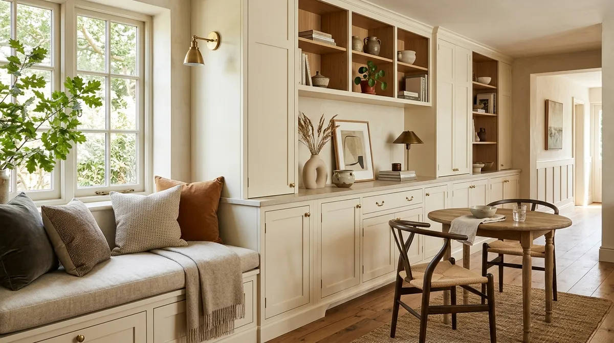
According to reports, matching trim and ceiling colors creates better flow throughout a space. This technique eliminates harsh visual breaks that can make rooms feel choppy or disconnected. When trim and ceilings work together harmoniously, the eye moves smoothly around the room, contributing to that coveted calm, cohesive feeling.
Consistent Temperature: Warm or Cool Tones
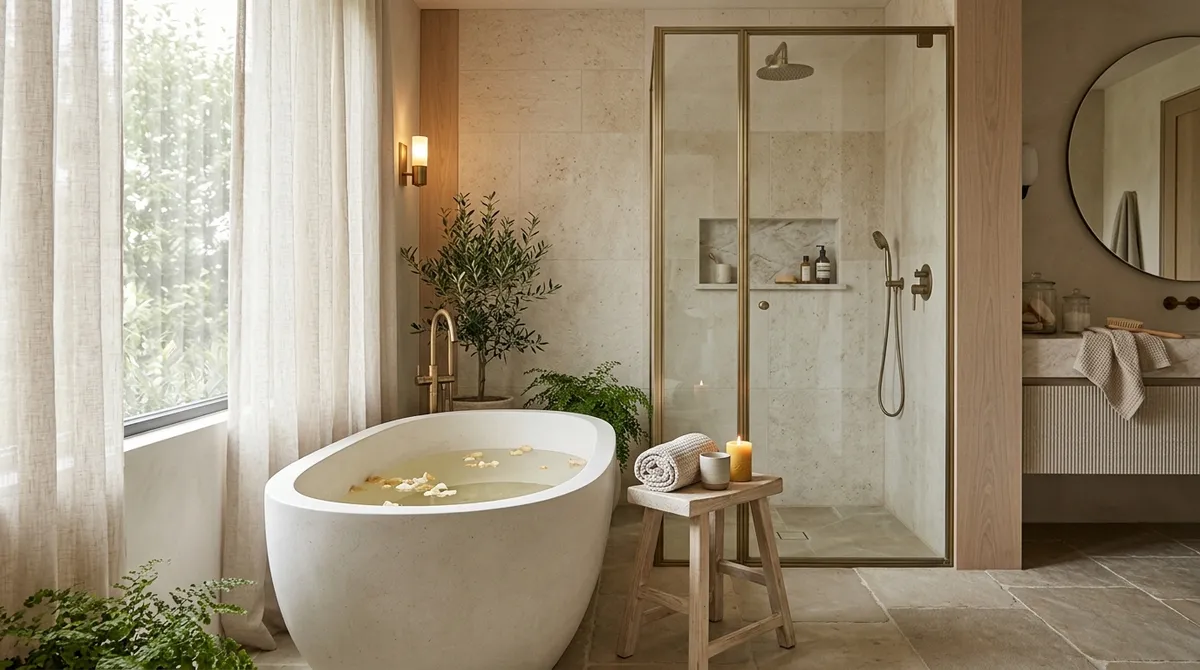
Layering warm or cool tones consistently throughout a room prevents the jarring effect of mixed color temperatures. Designers recommend choosing either warm undertones or cool undertones and maintaining that temperature across paint colors, fabrics, and decorative accessories. This consistency creates visual unity and supports the serene atmosphere many homeowners seek.
Making Design Achievable for Everyone
These color strategies prove that sophisticated design doesn't require professional training or unlimited budgets. According to reports, these principles can be implemented through paint and affordable decor swaps, making elevated design accessible to non-professionals. The key lies in understanding how color psychology affects our perception of space and applying these designer-backed principles thoughtfully.
The Psychology Behind Color Harmony
The reason certain color combinations feel "calm" versus "chaotic" relates to how our brains process visual information. Cohesive color schemes reduce visual noise, allowing our minds to relax rather than work overtime trying to make sense of competing elements. This psychological response explains why implementing these six strategies can transform not just how a room looks, but how it feels to spend time there.
Implementation Tips
Start with one strategy rather than attempting all six simultaneously. Paint remains one of the most cost-effective ways to implement these color principles, offering maximum impact for minimal investment. Consider creating a mood board or color samples before committing to ensure your chosen palette achieves the harmony you're seeking.